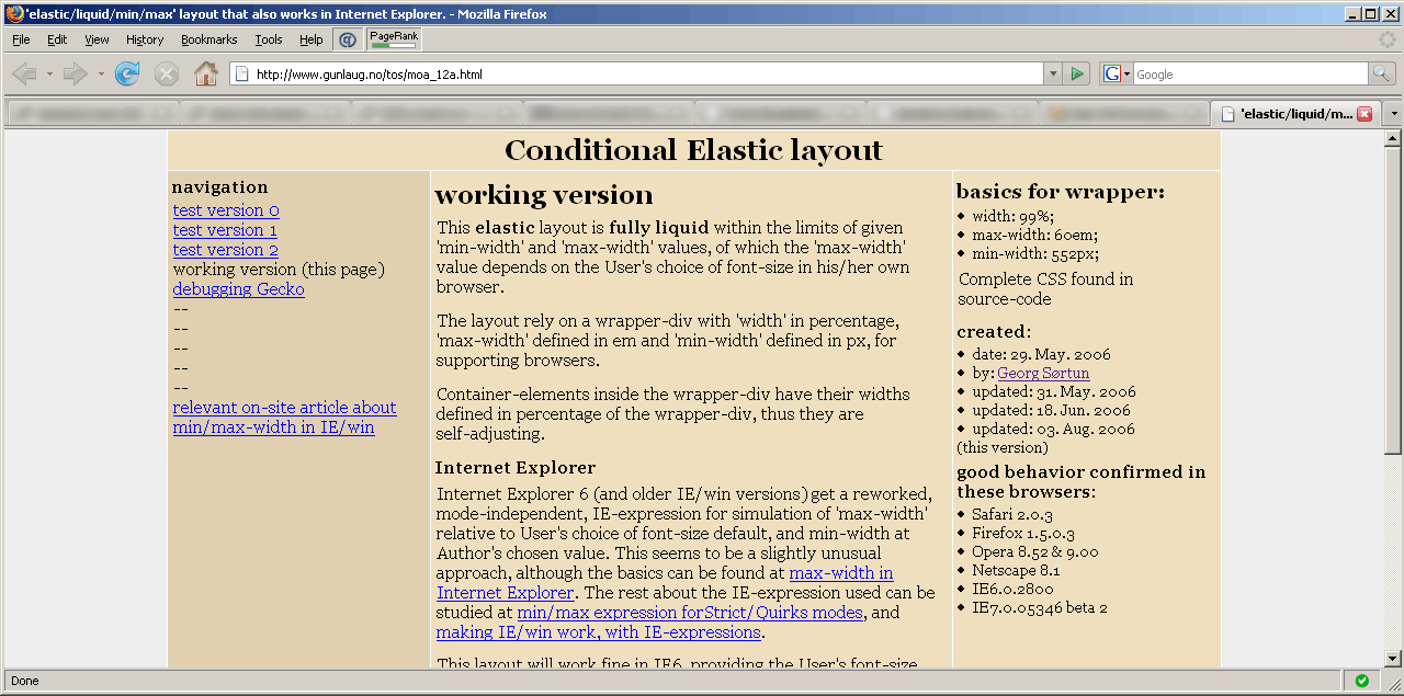
Change width of your browser-window to see how it works.


The images used in this demo are 1280 × 635 pixels in size. A 'max-width: 100%' is applied, with a 'width: 100%' workaround for older IE-versions.
The upper image is rather complex, and will deteriorate quickly in most browsers when scaled.
The lower image is more “forgiving”, and will survive scaling quite well.
Obviously: IE6' lack of ratio-preservation is a potential problem.
created: 10.sep.2007
by: Georg Sørtun
See relevant article for more on the subject.