additions…
…web design…
equal height columns…
You'll find ways to create “equal height columns” all over the web. The more popular methods can be found through a quick google-search, and I have even listed some of them here to save you the search.
- Equal Height Columns - revisited
- PVII Equal Height CSS Columns
- Companion column method
- Creating Liquid Faux Columns
The above appear to work – under the right conditions. There isn't really much of a need for a new “equal height” method, so that's why I haven't created one.
Instead I have taken a method directly from existing CSS standards – one that has been around for years, and added a few bits and pieces so it can actually be used in today's browsers.
CSS table based equal height columns…
First: here's the Demo: CSS based equal height columns so you can see for yourself. I recommend the use of one of the better of today's browsers, but even IE6 and IE7 should be able to make something out of it.

source order vs. visual order:
We can of course also reverse the order of the columns in a CSS table – see the same Demo: CSS based equal height columns in reverse. This may be necessary when we're into internationalizaton, but may also come handy when we only want some control over visual order vs. source order.
If we want even more source vs. visual control, the visual order can be manipulated by offsetting content from one table-cell so it appears to be in another. See the Demo: source ordered CSS table for an example of that.
all according to CSS standards:
You should definitely read about The CSS table model on which the whole thing is based. All CSS2/2.1 capable browsers can render that layout correctly, and – as mentioned – even Internet Explorer for windows should be close enough for comfort after being given a huge amount of help.
You can also check where I've borrowed the basics from, in case you want to see how IE/win prior to IE8 treats Roger Johansson's original “equal height boxes”.
work around IE's lack of standard support:
Now, no version of Internet Explorer prior to IE8 support the part of CSS standard used to create those equal height columns, which to most web designers means the CSS table properties are useless given the wide spread Internet Explorer has. However, we can often fake standard behavior in Internet Explorer prior to IE8, so – maybe – the CSS table can find its uses after all?
I will in the following dissect my own solution to a number of problems with older IE/win' lack of CSS table support, as each part has its purpose and can – and indeed should – be tuned to go with any such “equal height columns” layout.
 Heavy use of IE-expressions
ahead, which means: no Javascript support – no good in IE/win prior to
IE8. It won't fall apart in IE/win anyway though, just not look as good as in proper
browsers.
Heavy use of IE-expressions
ahead, which means: no Javascript support – no good in IE/win prior to
IE8. It won't fall apart in IE/win anyway though, just not look as good as in proper
browsers.
Update 19.mar.2009: IE8 supports CSS table, and ignores IE-expressions when in proper standards mode. All my demos are checked/updated to make sure they work in IE8 in IE7 mode too.
a basic 3 column CSS table…
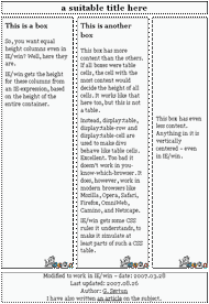
Header and footer in the Demo: CSS based equal height columns are not parts of the CSS table itself, so they are left out in the following.
basic HTML:
<div class="equal">
<div id="row" class="row">
<div  class="one">
<h2>This is a box</h2>
<p>...a normal paragraph...</p>
</div>
<div  class="two">
<h2>This is another box</h2>
<p>...a normal paragraph...</p>
<p>...another normal paragraph...</p>
</div>
<div class="three">
<p>...vertically centered...</p>
</div>
</div>
</div>
The above is a quite ordinary and complete set of elements for 3 sections, which can be styled anyway we like.
basic styling of my CSS table:
.equal {
display:table;
border-collapse:separate;
}
.row {
display:table-row;
}
.row div {
display:table-cell;
}
The properties/values above are turning the simple HTML structure into a CSS table – in accordance with The CSS table model. Works in all major browsers but Internet Explorer.
additional styling of my CSS table:
.equal {
table-layout: fixed /* [1] */;
direction: rtl /* [2] */;
}
.row div {
direction: ltr /* [3] */;
}
The above are optional. Some are used in some of the demo cases but not in others. The shown properties/values... 'prevents the table from expanding'[1], reverses 'the visual order of the columns'[2] and make sure everything in the columns is 'displayed in accordance with the western language used'[3].
Again: it is important to understand The CSS table model before starting to add or subtract source code and CSS properties. Otherwise we risk ending up with non-working or destructive junk.
Note that even browsers that support CSS table, do have some bugs and weaknesses. Some of the weaknesses are related to incomplete standards and differences between CSS2 and CSS2.1, while some are just browser-bugs.
The best working cure for those bugs and weaknesses is to keep the source-code construction and styling as complete and identical to an HTML table as possible – like the above. “Minimalism” is not recommended, but thorough testing across browser-land is.
further styling of my CSS table:
.equal {
margin:0 auto;
border-spacing:10px;
width:600px;
text-align: left;
}
.row div {
background:#f7f8f9
url(background-at-bottom.png)
right bottom no-repeat;
border: solid 1px #bbb /* NOTE */;
padding-bottom: 30px /* NOTE */;
}
.row .one {
width:200px;
}
.row .two {
width:200px;
}
#three {
vertical-align:middle /* NOTE */;
}
.row div h2 {
margin:0 0 0.5em 0;
padding:0.5em 10px;
font-size:120%;
color:#333;
}
.row div p {
font-size: 100%;
margin:0.5em 0;
padding: 0 10px;
}
Most of the styles above have only “beautification” purposes, but when attempting to replicate the appearance of the CSS table in IE/win, a few of the styles must be taken into account. I've marked those with /* NOTE */.
basic compensations for IE/win…
IE/win prior to IE8 needs some compensations through added properties/values, because we're letting IE deal with something it can handle: contained floats. After all: IE prior to IE8 can't deal with a proper CSS table, so it will simply ignore most of the styles more capable browsers use.
.equal {
padding: 10px 0;
width: 578px;
}
.row {
margin-top: 10px;
height: 1%;
}
.row div {
float:left;
position: relative;
}
.row .one {
margin-left:-1px;
}
.row .two {
margin-left:10px;
}
.row .three {
width:154px;
margin-left: 10px;
margin-right: -10px;
}
The above compensations are placed first in the <!--[if IE]> commented styles or linked-in stylesheet, so some values can be changed by relevant IE-expressions later on. The order is always important when using IE-expressions.
faking “equal height” in IE6…
Now we can make IE6 (and older versions) even out the height of a number of elements so they appear as tall as the tallest one. I use an IE-expression for that.
The following expression reads the height of the container for all columns in a row – this reflects the height of the naturally tallest column, and then set the height of all columns to fill that container without pushing it taller.
* html .row div {height: expression(eval(document.compatMode &&
document.compatMode=='CSS1Compat') ?
(parseFloat(this.parentNode.offsetHeight)-33)
:(parseFloat(this.parentNode.offsetHeight)-1));}
not quite the same height.
If you look closely at the Demo: CSS based equal height columns in IE6, you'll see that the columns have almost the same height. That little 1px difference is necessary to make IE adjust properly to the naturally tallest column even if font-resizing is applied, as a simple expression like the above will otherwise not be able to adjust backwards towards shorter columns.
It is easy to make columns exactly equal in height, if we sort out which column is naturally tallest beforehand and only apply height-adjustment to the other columns. Since I wanted a simple expression that can take an unknown number of columns, I accepted the slight “miscalculation;”.
Keeping the calculated height 1px shorter than the naturally tallest column and letting IE6' auto-expansion bug handle the overshot, provides us with an – at least to me – acceptable compromise for most cases.
multirow CSS tables:
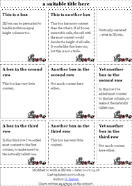
The expression allow for multiple rows, like in a real table, even in IE/win.
See Demo: multirow equal height columns for proof.
This opens up CSS tables to a range of uses beyond the simple equal height columns in a page, without being seriously hampered by IE/win's lack of support.
mode independency.
By checking for mode in the expression, we can alter how much shorter the calculated height must be to become 1px shorter than the naturally tallest column, and insert the correct number to subtract for each mode. This is necessary to compensate for box model differences, as vertical paddings will otherwise make IE6 make the calculated height too tall and go into an endless loop of adding height to all columns.
How much that has to be subtracted for each mode, depends on the actual layout and has to be calculated and inserted by the designer. Again: this is required given the simplicity of the expression used.
- -1 for quirks mode is self-evident, as both borders and vertical paddings are included in height – as IE/win sees it. Thus we only have to subtract 1px to make the expression-induced height become 1px shorter than the natural height of the tallest column.
- -33 for standard mode is easily figured out too, as...
padding-bottom: 30px
+ border-top-width: 1px
+ border-bottom-width: 1px
+ 1px “too short”
= -33
Remember: if the columns become too tall because of wrong value subtracted in the IE-expression, then IE/win will go into a spin and has to be shut down.
faking “equal height” in IE7…
IE7 has the same lack of support for CSS standards, but they have fixed one bug – the auto-expansion bug. Therefore we can't adjust the height-property since IE7 will then make all columns exactly the same height and the negative resizing of column-height if font-resizing is applied, is lost. Instead I've used 'min-height' in the following, and kept it 1px short.
html>body .row div {min-height: expression(
parseFloat(this.parentNode.offsetHeight)-33);}
mode independency through fallback.
The expression above is kept as simple as possible, because IE7 only needs a standard mode version. In quirks mode IE7 will fall back to the expression used for IE6 – with the same auto-expansion bug.
Also: the older IE-versions don't support the min-height property so there's really no need to keep them from seeing the expression. Nevertheless I've added a simple hack to keep them out.
box model correction #1…
Ideally I should have corrected the width of every column, as the border-width is included in the width in quirks mode but added in standard mode. Instead I am only adjusting the width of one column – the last one which is auto-adjusted in browsers that support CSS table. This isn't a perfect adjustment as the two leftmost columns are slightly too narrow in quirks mode, but it does give the “appearance” of being pixel-perfect.
.row .three {width: expression(eval(document.compatMode &&
document.compatMode=='CSS1Compat') ?
154
:158);}
The expression above can be used as an example on how to make mode-dependent adjustments of all kinds on almost all types of elements in IE/win.
box model correction #2…
The border-width is again playing box model tricks on us, and amongst a number of options I choose to adjust the margin on the left column to make everything “appear” to line up correctly. That's close enough for me, and all the tools (examples of expressions) are here for those who want it even more pixel-perfect.
.row .one {margin-left: expression(eval(document.compatMode &&
document.compatMode=='CSS1Compat') ?
-1
:0);}
I'm simply pulling the left column one border-width to the left in standard mode, to make the columns line up correctly relative to the header and footer.
simulating vertical-align…
The paragraph in the rightmost column should be vertically centered – as it is in all CSS table supporting browsers. So, to keep the illusion going in IE/win I have included a workaround from another one of my creations.
#three p {margin-top: expression(((three.offsetHeight/2)
-(parseInt(offsetHeight)/2) -2) <0 ? "0" :
(three.offsetHeight/2)
-(parseInt(offsetHeight)/2) -2 +'px') ;}
Note that this expression is not optimized for use under these conditions.
For complete description, see article: fully centered across browser-land.
going to print…
The “norm” around here is to keep styles separate for each media – using @media wrappers. However, IE/win doesn't respect media when it comes to IE-expressions, so they will affect print-output unless we reset them in our print-styles.
@media print {
html #row div {height: auto!important;}
html #row div {min-height: 0!important;}
.row .three {width: auto!important;}
.row .one {margin-left: 0!important;}
#three p {margin-top: 6px!important;}
}
The above will reset the properties affected by screen targeting IE-expressions, so they do not apply when document is printed.
why use CSS tables:
I've read comments along the lines of...
If we can use CSS tables, why can't we just use HTML tables instead? HTML tables work in all browsers.
Yes, they do.
However, those who write comments like that have missed the point: CSS tables are not tables
– they are just styled to look like tables. CSS tables can be used whenever and wherever we want to
replicate the table-look, unlike HTML tables which should only be used to lay out tabular data/content.
Never mind the fact that excessive use of HTML tables for layout purposes may make a document ever so slightly less accessible. We can make any CSS based solution at least as inaccessible, and we have to misuse and nest HTML tables quite a bit for that to become an issue in today's browsers and Assistive technology.
Once we get too hung up in the visual appearance on screen, accessibility tends to suffer a bit
anyway. What matters most accessibility-wise is what we end up serving our users – with, and without, CSS
and/or all the other purely visual stuff attached.
If you don't know what you're serving on that basic level, why not ask Lynx.
the advantage of having choices:
To some the differences between HTML tables and CSS tables are only related to standards and semantics. To me the simple fact that I can choose to style the entire HTML construction to look like a table, or like anything but a table, makes much more of a difference. We can't make that kind of choices with HTML tables.
One of the most obvious choices I can make is to linearize my content for print or handheld or whatever non-screen media I need it to go on. Such a transformation is easy since my CSS table can simply be limited to screen and the HTML construction is thereby completely open for whatever media-dependent styles I want to add.
finally…
After having gone through all the workaround-garbage above, one has the right to ask questions. I have asked most questions myself, and have listed a few of them – with possible answers – below.
-
Question: why use a lot of non-valid IE-expressions to work around IE/win's lack of standard support?
Answer: IE/win's lack of standard support is limiting the use of a perfectly good set of CSS properties/values, and I don't like to have that kind of limitations imposed on my work as a web designer – or web carpenter as I like to call myself. -
Question: what's wrong with the other “equal height columns” options?
Answer: nothing – when they work. However, I like to have as many options as possible – even if I have to create some myself, so I can choose the best one for the job in each case. -
Question: why use IE-expressions that are non-valid CSS, when regular Javascript would do?
Answer: mainly because I'm fixing a “lack of CSS support” problem, but also because IE-expressions appear to be faster. -
Question: what is the downside of using CSS tables (with workarounds for IE/win)?
Answer: source-order is fixed in accordance with table-rules, and our ability to rearrange the visual order vs. the source order is somewhat limited.
I have worked around that limitation in my Demo: source ordered CSS table, but although it can be done with pure CSS, Gecko-browsers weak CSS table handling made it “tricky business” to say the least.
I'd prefer an improved IE/win instead of all this hacking. However, since I have no say in the development of browsers I'll settle for the next best: a browser that appears to work as intended.
The good thing about the exemplified use of re-styling and IE-expressions, is that it doesn't seriously break anything if the expressions fail to kick in because javascript support is turned off or whatever. IE/win gets what it can handle no matter what, which is perfectly in line with my thought about fixes and enhancement for any old browser.
One day I may be able to perfect my IE-expressions and achive an even better appearance. Until then I'll just leave the Demo: CSS based equal height columns solutions on my site, in case I – or someone else – may need them.
sincerely 
Hageland 26.aug.2007
20.mar.2008 - added notes concerning IE8 beta.
19.mar.2009 - revised notes for IE8 final.
last rev: 19.mar.2009
additions…